Expressive type
Hebrew Calligraphy Fonts: Choosing Expressive Type
An expressive title can set the mood before anyone finishes reading the words. The useful question is not how much decoration you can add, but which movement, contrast, and rhythm belong to this particular message.
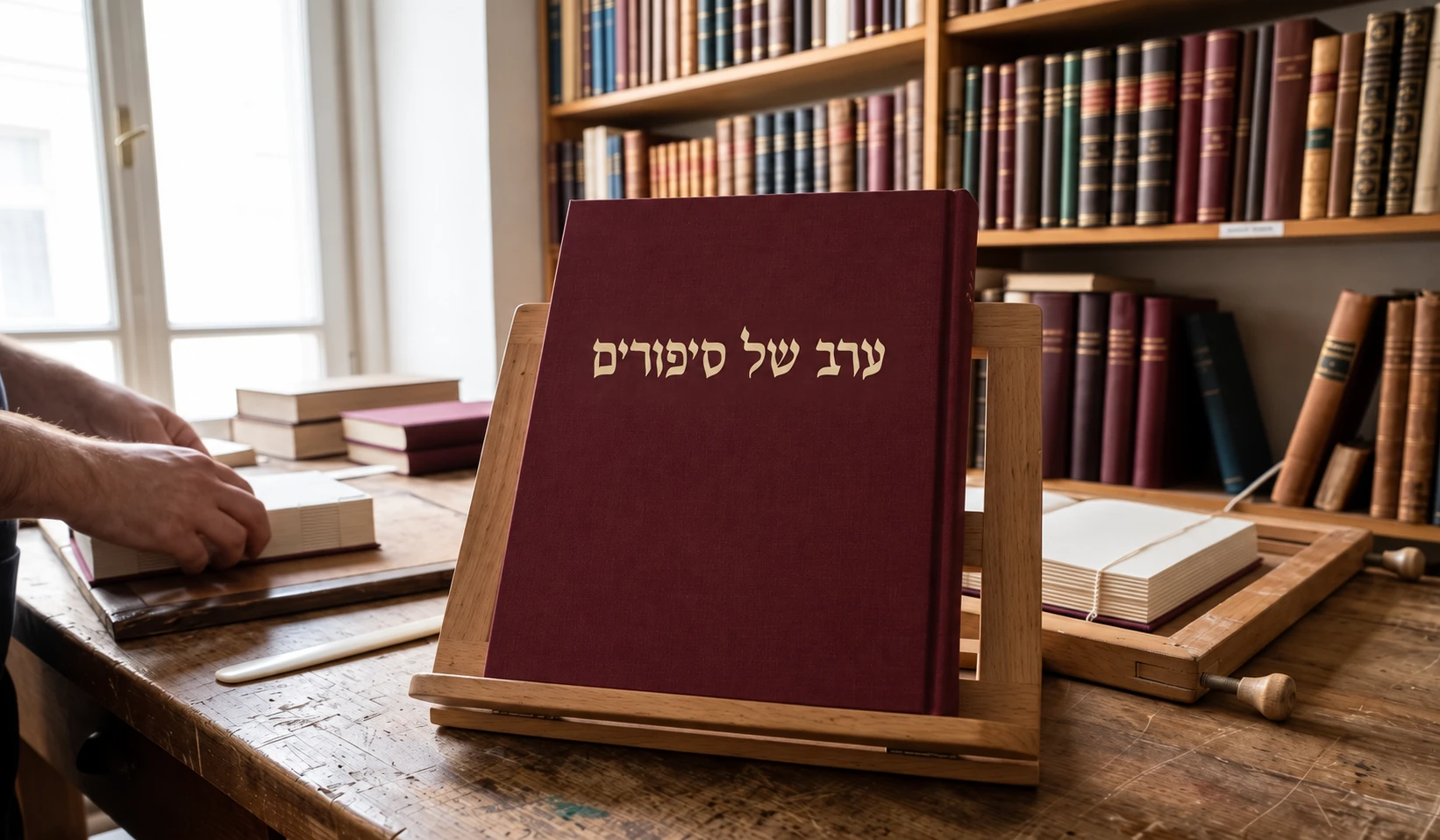
Calligraphy, handwriting, and ornament
These terms describe different qualities. A calligraphic design can suggest the movement and contrast of a writing tool while keeping a highly controlled structure. A handwriting-style face can feel personal through rhythm and irregular joins. Decorative alternates add another layer; they are not what makes every calligraphic design calligraphic.
Tamir is a useful contrast to the three main examples: its tall, narrow forms and gentle irregularity suggest handwriting. Lilit, Rapaport, and Tehilim explore more pronounced display contrast in different ways. Choose between them by looking at the phrase and its setting, rather than treating all expressive Hebrew type as one category.
Compare the same words
Use the same short title in each face first. Look at how the strokes thicken and thin, how close the counters feel, and where terminals lead the eye. Lilit combines a tall structure with sharp details; Rapaport creates a dense, moving rhythm; Tehilim carries a ceremonial, traditional-inspired character.
These are starting observations, not fixed meanings. The text, color, size, and surrounding imagery can change the mood. The live comparison removes much of that context so you can examine the letters. The next step is to return the title to its intended invitation, cover, or poster.
The live specimen is loading. You can also view this font on its specimen page.
The live specimen is loading. You can also view this font on its specimen page.
The live specimen is loading. You can also view this font on its specimen page.
The live specimen is loading. You can also view this font on its specimen page.
Use alternates where they have room
Lilit includes decorative alternatives illustrated in our OpenType guide. Start from the default forms and change a small number of letters with a compositional purpose: opening the beginning of a line, balancing an ending, or filling a deliberate area of space. More alternates do not automatically make a more convincing title.
Inspect neighboring letters, the line above, and the edge of the frame. A flourish that looks elegant in isolation can create a collision or an unintended visual connection in a word. Keep the text editable while choosing forms, and check the exported result in the application where it will be read.
Give the title room without distorting it
Tehilim’s variable width changes the design along an axis built into the font. It is different from horizontally stretching a finished outline, and different again from adding space between letters. Use the variable-font guide to compare those settings in a live example.
Before making any title fit a tight rectangle, ask whether the rectangle should change. Rapaport’s dense forms can benefit from generous surroundings and a short line. Adjusting the composition can preserve the character of the type more successfully than squeezing every word into an arbitrary width.
Let supporting text do a quieter job
Dates, addresses, and explanatory paragraphs do not need to repeat the title’s dramatic treatment. Pair the heading with a quieter family, then balance the apparent size and weight of Hebrew and English. Give each role enough contrast to be found quickly without making the whole page compete for attention.
Finally, proof at the actual size. High-contrast details and ornaments may disappear when reduced. A traditional-inspired appearance also does not establish suitability for an entire religious text: check the required marks and reading task separately. A convincing display title and comfortable sustained reading are different design problems.
How to Pair Hebrew and English Fonts