Niqqud and marks
Hebrew Typography with Niqqud: A Practical Testing Guide
A font that contains Hebrew letters does not necessarily support every pointed text. Niqqud adds combining marks above, below, and inside letters, so coverage is only the first test. Placement, collisions, line spacing, software behavior, and the exact text all matter.
Define which marks the project actually needs
Start with the source text, not a generic alphabet. A children’s title, a language exercise, poetry, and a biblical passage can require different combinations. Make a test file from the project’s real words and punctuation.
Distinguish vowel points from cantillation and other specialist marks. A family name, visual style, or successful sample word does not prove complete support. Record the exact characters required before comparing fonts.
Check coverage before judging appearance
A missing mark may disappear, fall back to another font, or appear as a box. Inspect the glyph set when possible, then paste the complete text into the target application. Do not assume a browser preview matches every design tool.
Test base letters with all needed combinations, including final forms and dense sequences. Evaluate Penguin Sans, Efrat, or Tehilim from their current files; no one family is claimed to cover every marked-text use.
Inspect placement, collisions, and optical balance
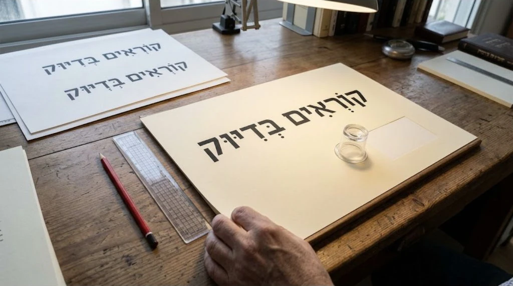
Zoom in to diagnose marks, then return to normal reading size. Look for points that drift from the letter, overlap neighboring marks, touch stems, or make one word appear darker than the surrounding line.
A technically centered mark may still feel optically wrong on an asymmetric letter. Compare repeated combinations across several words. One clean screenshot is not enough evidence for a whole text or a different weight.
Give marks enough vertical space
Niqqud can extend beyond the unpointed letter body. Tight line height may create collisions between lines even when each word looks correct alone. Test the densest lines and increase leading for the actual size and measure.
Check containers as well as paragraphs. Buttons, cards, input fields, and exported PDFs may clip marks through fixed heights or hidden overflow. Inspect top and bottom edges on every platform where the text will appear.
Verify shaping in the software and export
Combining marks depend on the font and the shaping engine. Test editable text in the application used for production, then inspect the PDF, image, webpage, or print proof that readers will receive. Preserve the original text for correction.
Avoid moving individual marks unless the workflow is controlled and the text is frozen. Manual fixes can break when copy changes, fonts reload, or files open elsewhere. Report repeatable problems with the exact word and file version.
Proof the complete text at final size
Read every line for language accuracy as well as typography. Confirm the spelling, points, punctuation, line breaks, and direction with a qualified reader when the content requires expertise. Visual polish cannot validate the text itself.
Print physical work on the intended paper and device. On screen, test narrow widths, zoom, and high-density displays. Keep a checklist of troublesome combinations so later revisions do not repeat the same inspection from memory.