Expressive styles
Hebrew Print and Handwriting Styles: How to Choose
Print and handwriting are not two sealed categories. A digital font can echo handwriting while remaining carefully constructed, and a calligraphic display face can be formal rather than casual. Choose by looking at structure, rhythm, and use, not by relying on the label alone.
Separate the labels from the visible evidence
A print style often suggests stable construction. A handwriting style may show changing rhythm, informal joins, or uneven motion. Calligraphic forms can reveal tool pressure and stroke contrast without pretending to be casual handwriting.
These descriptions overlap. Instead of asking which category is correct, name the traits that matter to the brief: narrow proportions, sharp terminals, open counters, bouncing rhythm, or a strong difference between thick and thin strokes.
Match the movement to the message
Tamir can suggest a personal, tall handwritten note. Lilit and Rapaport create more deliberate display voices through contrast and shaped terminals. Penguin Sans offers a steadier reference when the content needs clarity before expression.
Do not assign one fixed emotion to a family. Color, scale, spacing, paper, and surrounding imagery change the tone. Test the exact message: a wedding name, theatre title, protest line, and service instruction make different demands.
Choose a role that suits the reading length
A distinctive handwritten or calligraphic face may work beautifully for three words and become tiring across a paragraph. Compare the final number of words at the final size. Do not turn a successful title into evidence for body text.
If the expressive face owns the headline, pair it with quieter supporting text. Let the contrast create hierarchy. Repeating the same dramatic texture in dates, addresses, and instructions makes the page harder to scan.
Compose with the shapes instead of decorating them
Give tall letters, long terminals, and uneven rhythms room to act. Adjust the frame, line break, and surrounding white space before stretching the font or adding effects. The composition should explain why this voice was chosen.
Decorative alternates can solve a specific edge, opening, or balance problem. Start with the default text and change only forms that improve the whole line. More flourishes do not automatically create a more convincing handwritten result.
Keep bilingual expression intentional
A Hebrew handwriting voice does not require an English font that imitates the same movement exactly. Match role, energy, contrast, and apparent size. The two scripts can differ while still belonging to one hierarchy.
Use actual paired lines, not separate specimen words. Inspect names, dates, mixed numerals, and punctuation. If the chosen Hebrew family has limited Latin coverage, select a verified companion rather than forcing unsupported text.
Proof the style in its real medium
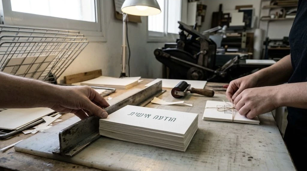
Thin contrast and fine terminals may disappear in small print, rough paper, embroidery, or low-resolution screens. Produce a proof in the intended material. A large monitor preview cannot establish production suitability.
Check spelling and direction before outlining or fabrication. Keep an editable source, record the file and features used, and ask a qualified reader to review important permanent text. Style cannot compensate for an incorrect phrase.