Personal lettering
Hebrew Tattoo Fonts: Choosing a Calligraphic Style
A name, a short promise, or a meaningful quotation can become a striking Hebrew tattoo. The choice starts with the exact words and continues through the shapes of the letters, their scale, and their place on the body. This guide uses Lilit and Tehilim mockups to show what to compare before you approve a calligraphic design.
Choose the words before the font
A Hebrew tattoo begins with a sentence you understand, not a beautiful shape found online. Write down the intended meaning, who it refers to, and whether you want a name, a quotation, or an original phrase. A font changes the tone of those words; it cannot correct a translation.
Ask a fluent Hebrew reader to check the exact wording in context before designing it. Names may have more than one accepted spelling, and a phrase may change with grammatical gender or number. For a quotation, compare it with the source rather than copying another tattoo. Keep one approved text file so later revisions do not quietly change a letter.
Hebrew reads from right to left. Final letters belong at the ends of words, and niqqud, when included, belongs to particular letters. Proofread the finished artwork as well as the typed text: a correct sentence can still become wrong when someone rearranges the layout or copies a mirrored picture.
What makes a calligraphic font right for your tattoo?
Calligraphy describes the movement and contrast of the strokes. It does not necessarily mean everyday Hebrew cursive. Decide whether you want upright, formal letters, a restrained handwritten gesture, or a dramatic word with long flourishes. That decision should follow the meaning of the text and the space on the body.
Compare the actual name or phrase in each candidate. Look at the balance of thick and thin strokes, the open spaces inside letters, and the rhythm between them. A font that looks wonderful in its own name may produce an awkward gap or a crowded ending in yours. Judge the whole word at its planned size, then examine individual letters.
Lilit offers a tall, narrow display structure with pointed endings and decorative alternatives. Tehilim has a more traditional calligraphic character, with expanding terminals and branch-like details. These are two starting points for different moods, rather than a ranking of tattoo fonts. Neither a font description nor a mockup proves that a particular design can be tattooed at any size.
Lilit: let the flourish frame the name
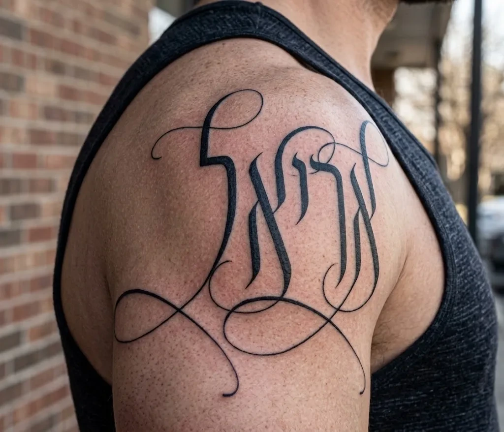
The Lilit shoulder mockup shows how a short name can become one large composition. Tall letters give the word its core, while sweeping strokes occupy the space around it. Compare that silhouette with a plain setting of your own name: decide whether the extra movement expresses something you want, or merely makes the sample more impressive.
Begin with the default letters, then add alternatives one at a time. A flourish should frame or extend the word without becoming a false letter, crossing a crucial opening, or joining two letters into an ambiguous shape. Leave room around the upper and lower strokes instead of squeezing the ornament into the same box as the basic word.
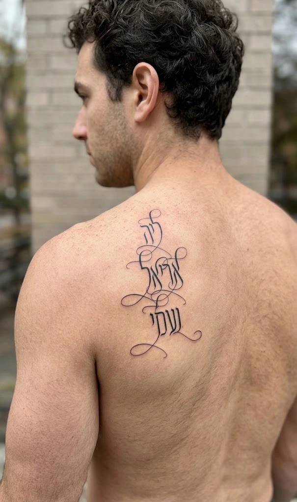
The separate Lilit back mockup explores a taller, stacked composition. It is useful for discussing the relationship between lines and the shoulder blade, but it is not a stencil to copy. A multi-line Hebrew design needs an unambiguous reading sequence; have a reader check the complete layout, not each word in isolation.
Tehilim: compare a phrase with a compact composition
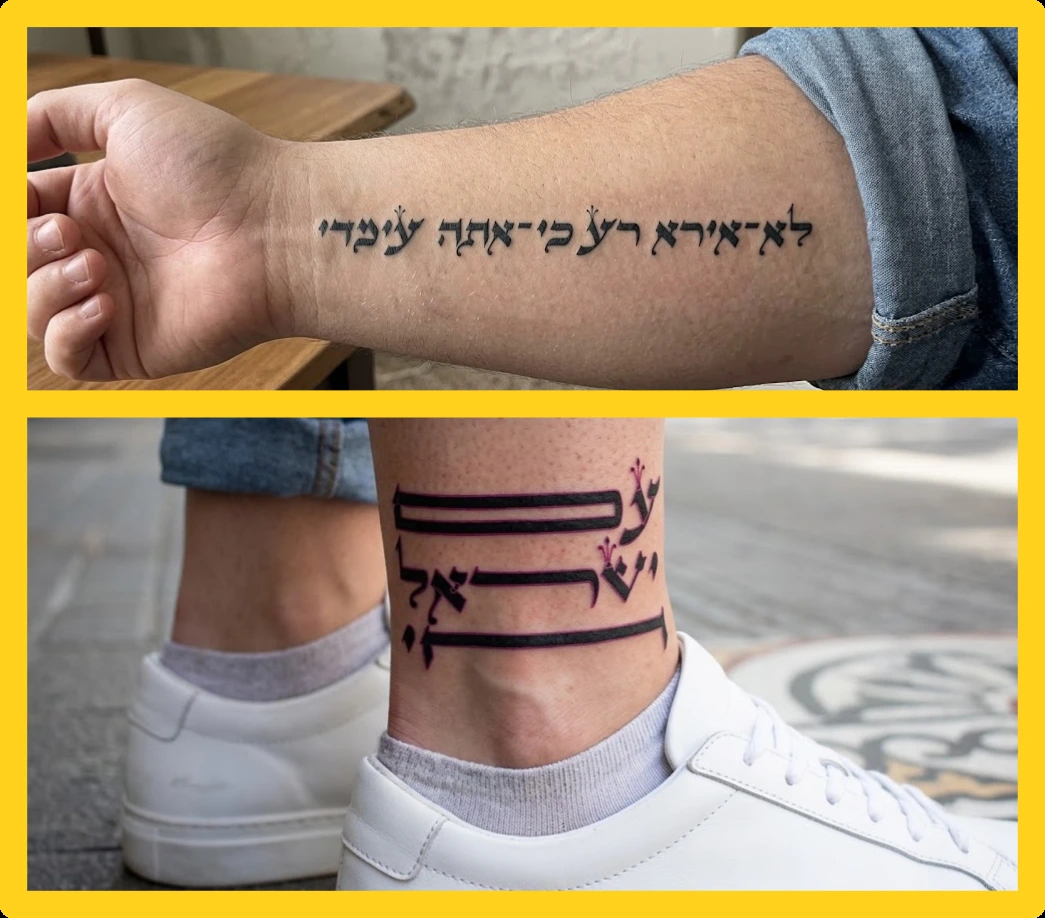
The Tehilim gallery places a horizontal Hebrew phrase on a forearm beside a compact ankle design. The forearm example asks the eye to follow a line; the ankle example makes the arrangement itself a stronger part of the image. Use that contrast to decide whether your tattoo should read immediately as text or invite closer attention to its composition.
For a phrase, compare the spaces between words with the spaces inside them. Decorative details should not hide a word boundary. For a stacked design, check the order of the lines and whether a long horizontal stroke is a letter, a flourish, or a separator. If a reader needs an explanation to decipher the wording, simplify the arrangement before adding more decoration.
Tehilim is a Hebrew display family; do not assume it supplies matching English lettering. If a date or Latin name joins the tattoo, proof that element separately and balance it with the Hebrew. Keep the Hebrew phrase intact rather than stretching individual letters or scattering words to fill the available outline.
Decide the size and placement with the tattoo artist
A screen preview has no physical scale until you define one. Print the design at its intended dimensions, including the full reach of the flourishes, and compare a few sizes. Ask the tattoo artist to assess the thinnest strokes, enclosed spaces, and gaps in this specific design. There is no universal font size that guarantees a successful tattoo.
Discuss the placement while looking at the body in a natural posture. A word that fits on flat paper may wrap around an arm, disappear near an edge, or change its apparent rhythm when the limb turns. Agree who the text is oriented toward and inspect the placement directly, rather than judging its reading direction only in a mirror or selfie.
Ask to see healed lettering examples from the artist and discuss which details they would adjust for your chosen placement. If the artist recommends more space or simpler strokes, revise the design and have the Hebrew checked again. The mockups here illustrate visual decisions; they do not document healed results or promise the same outcome on skin.
Treat niqqud and spelling as part of the artwork
Choose intentionally whether to include niqqud. It can clarify a reading or form part of a quotation, but it adds small, separate details that must be considered in the physical design. Have the exact marked text checked by someone who knows Hebrew niqqud; adding plausible-looking dots by eye is not proofreading.
Test the entire phrase in the chosen font and software. Do not infer mark support from an unpointed sample, and do not move a mark to a different letter just to improve the silhouette. If your selected font cannot render the approved wording correctly, change the typographic plan and proof it again before creating the stencil.
Approve the final artwork and stencil
Prepare a handoff with the approved Hebrew text, the final artwork, its dimensions, the chosen placement, and a reference showing the intended reading orientation. Keep an editable version and a fixed visual proof. Compare the exported artwork with the proof so substitutions, missing flourishes, or reversed letters do not enter during a software handoff.
Check the current font license before passing files to another person. Do not assume buying a font allows you to share the font software with the studio. Agree how the artist will receive and work with the design, and consult the license terms if the intended use or file sharing is unclear.
After any adjustment, compare the final stencil and its placement with the approved artwork together with the artist. Recheck every letter, word boundary, line break, and mark. The best choice for your tattoo is the font treatment whose meaning, shape, scale, and placement you can all approve with confidence.